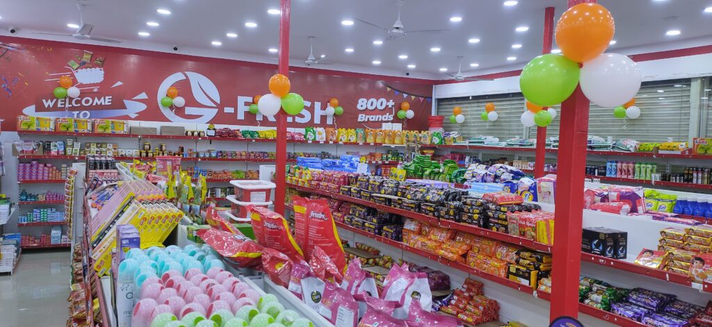
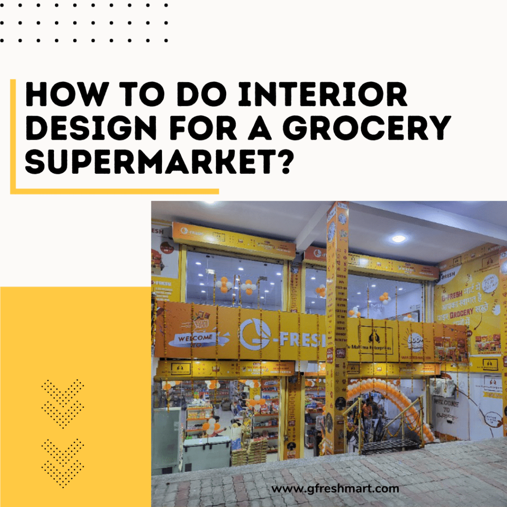
In the past, you might flourish in grocery supermarket retail without giving much thought to appearance thanks to beige shelves, dull linoleum floors, and antiquated signs. but no longer. In today’s cutthroat marketplace, having a handy location, a great product range, a friendly staff, and affordable rates are insufficient. Let’s look at some recent grocery Supermarket Interior Design ideas and trends that could improve your stores.
For skeptics and time-pressed shoppers, supermarkets must offer more. To encourage visitors, maintain a greater margin, and improve customer happiness, your physical site must contain branding, an engaging message, and the appropriate design cues.

Must Read – Supermarket Franchise vs. Independent Supermarket: Which One Is Better?
What is the Need for Supermarket Interior Design
Grocery shopping is typically a chore, however, for some folks, it occasionally serves as retail therapy. It’s a chore that requires wasting time at supermarkets that are adept at manipulating consumer decision-making to get customers to purchase products they don’t actually need.
Supermarket interior decoration aims to maximize this social structure. Retailers are aware of the significant effects that supermarket architecture and product placement may have on consumer spending.
A basic understanding of human psychology is necessary for developing a supermarket’s layout. The layout of a supermarket is carefully thought out by designers to maximize customer spending. Customers’ actions will be impacted by the store’s structure, flow, merchandise placement, and atmosphere.
By examining these layouts, retailers may determine their projected revenue and make educated decisions about the benefits and drawbacks of their product mix and where to place it.
How to pick an interior design for your grocery supermarket?
Customers must be taken into consideration while designing grocery supermarkets. This entails accommodating both prepared consumers with a list of necessary items and those who wish to explore.
According to studies on slow shopping, customers who spend longer time in stores report having a better experience and making larger purchases. Studies do indeed support the idea that “shopping should be a leisurely and fulfilling activity.”
Although limited by physical space, merchants with above-average square footage should seek ways to give their customers better interactions, open spaces, and other possibilities for slow shopping both inside and outside.
Not all shoppers have the time to linger; what about the customer who requires that one particular component? To get in and out quickly, fast shoppers require a layout that makes perfect sense, accommodates classic grid-perimeter patterns, and provides multi-channel navigation capabilities. Aisle-specific printed displays that are standalone or mounted on carts can also aid customers in locating the merchandise and check-out choice that will retain them back.
What is the minimum budget for supermarket interior design?
Thus, regardless of the design, a budget might be dependent on the materials to be utilized for choosing. Therefore, I would recommend that one should keep in mind an interior budget of, say, INR 900 per square foot for the same roughly. This is for a very simple design with budget materials to be employed.
Usually, 10% to 15% of the expense of building a home goes toward the kitchens and closets. Since the average cost to build a 1,000-square-foot home is ₹3000 per square foot, your budget should be around ₹3 lacks (INR 300,000). Regardless of the price you are spending for the mortgage, keep in mind that the average cost of construction is ₹33,000 per square foot. This is a fundamental rule to adhere to. It increases from this base price based on how much additional money you have to spend or how fancy you want to be.

Also Read – Importance of Digital Marketing for Your Supermarkets
What should your grocery supermarket interior design look like?
It takes long-term planning and independent thought to navigate the shifts in consumer behavior while keeping customers satisfied and safeguarding your bottom line.
Grid Design: The grid model is used to illustrate the most practical furniture arrangement while planning a supermarket. Long paths are used in this pattern, which is laid out in a grid by aligning them parallel to one another in a straight line. This layout style is used by retailers since it improves the effectiveness of the entire sales process.
In addition, it makes the best use of available space while ensuring higher product availability, and a quick shopping experience. The logistical components’ simplification offers yet another significant benefit by making it easier, for instance, to supply shelves and manage the numerous products that are available.
Should you work with a company or handle your supermarket interior design yourself?
Whether you decide to do it yourself or hire a designer is a very personal decision that undoubtedly depends on your situation. We think having a helping hand while you work through your design project is always beneficial, but if you feel like you have the desire, enthusiasm, and imagination for it, go forward and create something lovely for yourself.
Therefore, an appealing interior is equivalent to the success of any supermarket. People won’t be drawn to your supermarket and come to you for their household needs until your interior and outside are vibrant and alluring.
The supermarket should have plenty of room and well-built, compact racks that exhibit your products with good lighting and good ventilation. Also, there needs to be plenty of room for the counter. You can visit for more information.
Conclusion
In conclusion, the supermarket interior design is an important factor that can significantly impact customer spending and satisfaction. A well-designed supermarket should cater to both slow and fast shoppers while maximizing the available space to ensure higher product availability and a quick shopping experience.
Don’t Miss This – How to Increase Sales of Supermarket in 2024

Siwan Bihar India